 To celebrate the launch of Ali Redford’s The Mermaid Who Couldn’t, artist Kara Simpson talks us through how she created and compiled the beautifully rich illustrations inside…
When Ali first told me about her idea for a book about a mermaid I was really excited to get started on it. There are such lovely visual possibilities when illustrating the ocean and its creatures! I got started on developing the look of the main character as soon as she told me the rough story outline. I tend to do a lot of my sketching digitally these days as I’ve gotten so used to working in Photoshop using a trackpad and pen. Plus, it’s easier to correct mistakes, which saves a lot of time at this stage. Once Ali gave me the first rough draft of the text for the book I made a start on some rough thumbnail sketches for the storyboard, fitting the text around the required number of illustrated pages. This can take a while to get right and Ali and I met up a few times with printed mock ups to discuss the flow and feel of the text and illustrations, and to make any necessary adjustments. 
On this project, I had a good amount of time whilst Ali finely tuned the text, giving me the chance to continue developing the storyboard and get it looking just the way I wanted. I even had time to do a tonal study of the storyboard using only black and white. I’d never done this before and don’t consider it essential, but for this project I think it really helped me be brave and bold with the colours in the finished project, as I tried to replicate the strong contrasts I’d gotten from the black and white versions. Once everyone was happy with the layout and feel of the book from the storyboard I then went ahead and started the finished pages at their full size. For each illustration I copied the relevant storyboard image onto a new document and then spent time with a soft Photoshop brush drawing the image to a higher standard only using shades of grey. I will place the text on the page and play around with font sizes and styles until I find ones that work.

Often I find that the composition needs to be played around with because what worked on a small sketch sometimes doesn’t when things are scaled up to the finished size. Sometimes the finished image will be completely different from the storyboard sketch. The finished sketch will have a lot more detail and I like to spend a few days on each one, making sure that everything makes sense and that the characters and details are well drawn. I’ve found that taking more time and care at this stage makes things easier in the long run. Mistakes are hard to rectify once colours, shading and lighting have been added! When I have the sketch looking the best I can, I start to add the colours. At first I put down flat blocks of colour until things look right and the colours go well together.
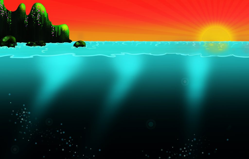
Then I start to add depth and shade in different Photoshop layers till the image really starts to stand out. Also in separate layers I will add highlights, extra details and sometimes some textures to really bring things to life. Keeping things in separate layers makes it easy to rectify mistakes without having to start again. This also makes it easier to be more experimental with different effects. I continue with this until I have everything to a finished standard. Once I have done this for each page I spend a week or two making sure that the characters, style and colours were consistent across the whole book. Then assuming that everyone is happy and there are no mistakes in the spelling or grammar (my bad), then my part is finished and the files are handed to the publisher to be sent to print.
Find out more about The Mermaid Who Couldn’t and buy the book here.
