Pride flags… how has the LGBTQIA+ flag evolved?
By Victoria Barron
Flags. There’s no getting around the fact that there are a lot them…particularly within LGBTQ+ communities.
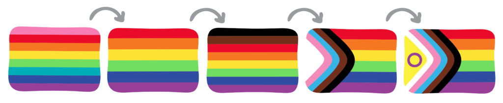
The most recognisable and widely-used LGBTQ+ flag is the 1979 six-stripe rainbow (number 2 on image) —a uniting design to represent all those under the LGBTQ+ umbrella. This was adapted from an eight-stripe design (featuring additional pink and turquoise stripes) created in 1978 by Gilbert Baker.
In 2017, the city of Philadelphia added brown and black stripes in recognition of BIPOC (black, indigenous, and people of colour) members of the LGBTQ+ community. From this adaptation, and only a year later (2018), Daniel Quasar created Progress Pride flag, taking the brown and black stripes from the Philly pride flag and adding pale blue, pale pink, and white stripes to recognise the trans and non-binary people, along with those living with HIV/AIDS. Quasar overlaid these colours on the 1979 rainbow flag, formed to resemble the shape of an arrow, symbolising the forward motion of the LGBTQ+ movement, now known as the ‘progress flag’.
The most recent design came in 2023, in which Valentino Vecchietti added the yellow and purple ring of the intersex flag within Quasar’s arrow design, representing better inclusion and visibility of intersex people.
But, why don’t we just use the one rainbow or progress flags? Do we really need to create individual flags for the hundreds of labels and micro labels, or all the types of relationship or attraction contained within?
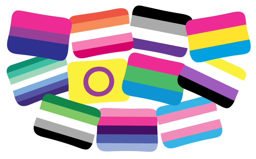
Row 2 (left to right): Gay/vincian, intersex, poly-sexual/romantic, non-binary
Row 3 (left to right): Aromantic/aro, omni-sexual/romantic, transgender
While it may seem irrelevant to some, these community-led, and community-adopted designs can hold a great deal of meaning for an individual’s identity; affirming a sense of place, unity and validation.
I occasionally hear the view that the ‘average person’ doesn’t have the time—or inclination—to be an expert in all the LGBTQ+ flags/identities out there. But, I honestly don’t believe that LGBTQ+ people demand each and every design to be memorised by society. After all, it takes a very long time for the more ‘established’ (or broader umbrella) identities/flags to even vaguely make it into the public consciousness (such as the pink-purple-blue of Michael Page’s 1998 bisexual flag).
I suspect that most queer folks would simply be happy for any of the flags/identities to be recognised by a non-LGBTQ+ person.
Specific identity flags can build a connection to others within queer spaces, and can also provide a useful visual tool within LGBTQ+ education/awareness. I, myself, used many flags to highlight different categories or identities within Perfectly Queer.
Call me a nerd, but I find LGBTQ+ flags fascinating. I love learning what the colours represent, seeing them lifted up by the communities and knowing there are queer people out there who feel specifically represented and included; all distinct parts of the whole.
Yes, it’s important to rally around universally recognised LGBTQ+ rainbow/progress flags, but I believe that all these other designs only help to highlight the scale, diversity, and inclusion of the huge spectrum of LGBTQ+ people that make up this wonderful rainbow!
Victoria Barron (she/her) is an illustrator and author with two LGBTQ+ education books (published in 2023): Perfectly Queer, and Amazing Ace, Awesome Aro. For more, visit: www.victoriabarron.com
www.instagram.com/victoriabarronart
www.youtube.com/@victoriabarron